Scottish Rite for Children
Transforming a 100-year-old hospital brand into a modern, healthcare category disruptor aimed at the next generation of children’s health.
Scottish Rite for Children, located in Dallas, is a pediatric hospital specializing in the treatment of orthopedic conditions and sports injuries, as well as certain related arthritic and neurological disorders and learning disorders, such as dyslexia.
Scottish Rite treats thousands of children for orthopedic conditions, including scoliosis, club foot, congenital dislocated hip, Legg-Perthes, limb-length differences and hand conditions, as well as children with sports injuries. In partnership with Genuine Article Communications and TRG, Scottish Rite for Children engaged us in a multi-year effort to revamp the brand and develop a capital campaign identity to correspond with their centennial year in 2021. We first addressed the verbal identity by shortening the organization’s name from Texas Scottish Rite Hospital for Children to Scottish Rite for Children to better align with their future growth plans. Next, we refreshed, rather than overhauled, their logo after the audit and interviews revealed a strong level of equity and affinity for the crayon graphic in their current logo. However, as they were starting to leverage new services, such as sports medicine, that would need to be marketed to a slightly older audience, we created an entirely new visual identity system for the brand that would allow them to better connect with both younger and older youth audiences.
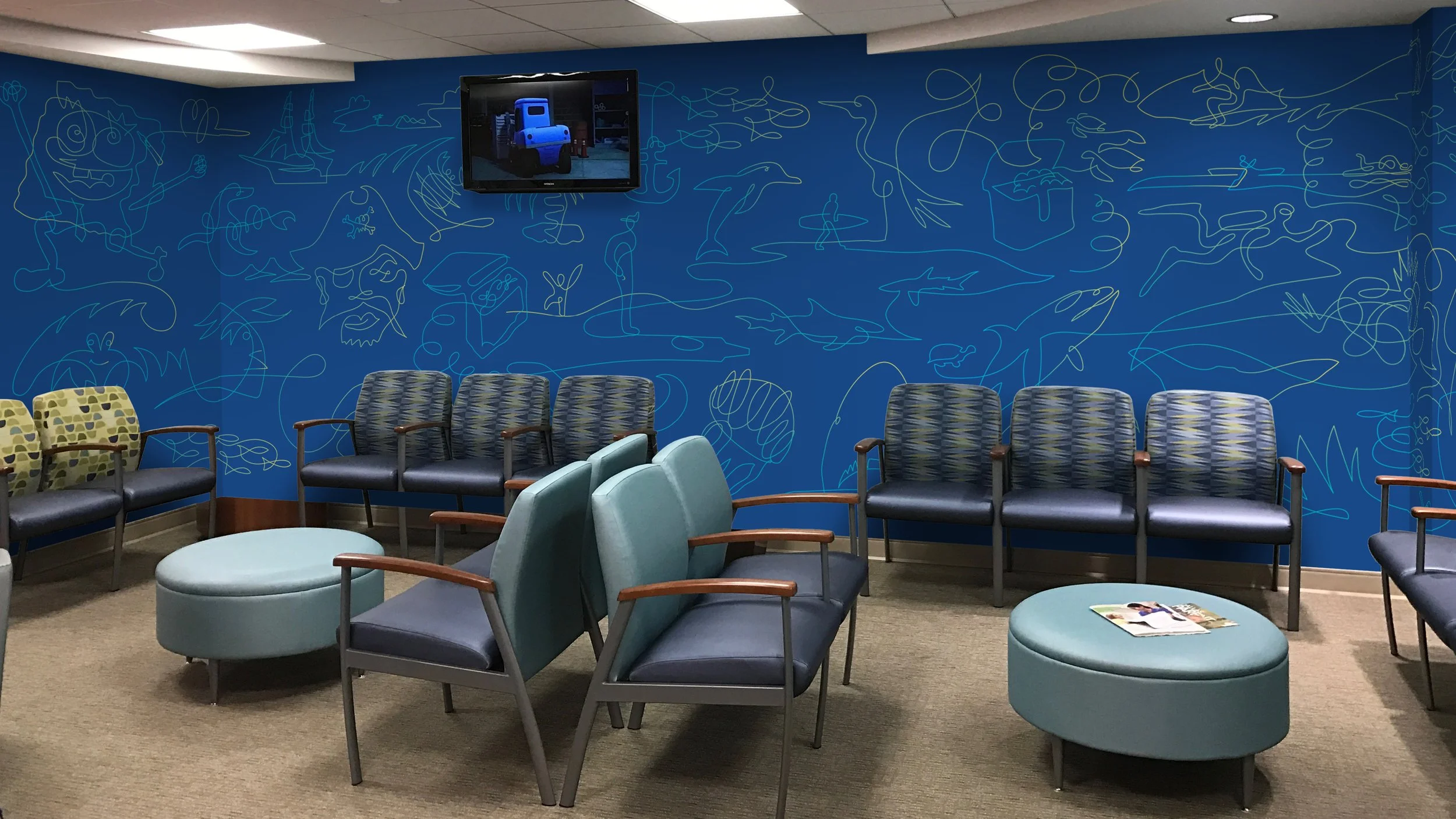
The new identity tells a visual story that represents the treatment relationship between a patient and doctor. It speaks to getting children back to playing and moving freely in various stages of their treatment. The identity relaunch touched all essential brand communications, plus exterior wayfinding signage, as well as interactive wall murals custom designed for each different waiting area in the hospital. Each wall mural was designed to provide an escape from the apprehension of being in a hospital with engaging fantasy land scenes, familiar pop culture references, and hidden crayons throughout to turn the experience into an interactive, memorable game.
The overarching message that threads its way through the identity is based in movement, play, and giving children back their childhood. This comes to life in an illustration style created by illustrator Felix Sockwell. The child-like line drawings tell a story of children playing, free from obstacles, with the continuous line style telling the story of a life-long doctor patient relationship. To give the identity a deep tool kit to evolve with, a large system of icons were created by Felix to allow their in-house design team to build new worlds of play.
Corresponding with the official rollout of the brand and the BOUNDLESS centennial campaign in 2020, brand training sessions were scheduled and a comprehensive guidelines document was created for use by their internal design team and other marketing vendors.


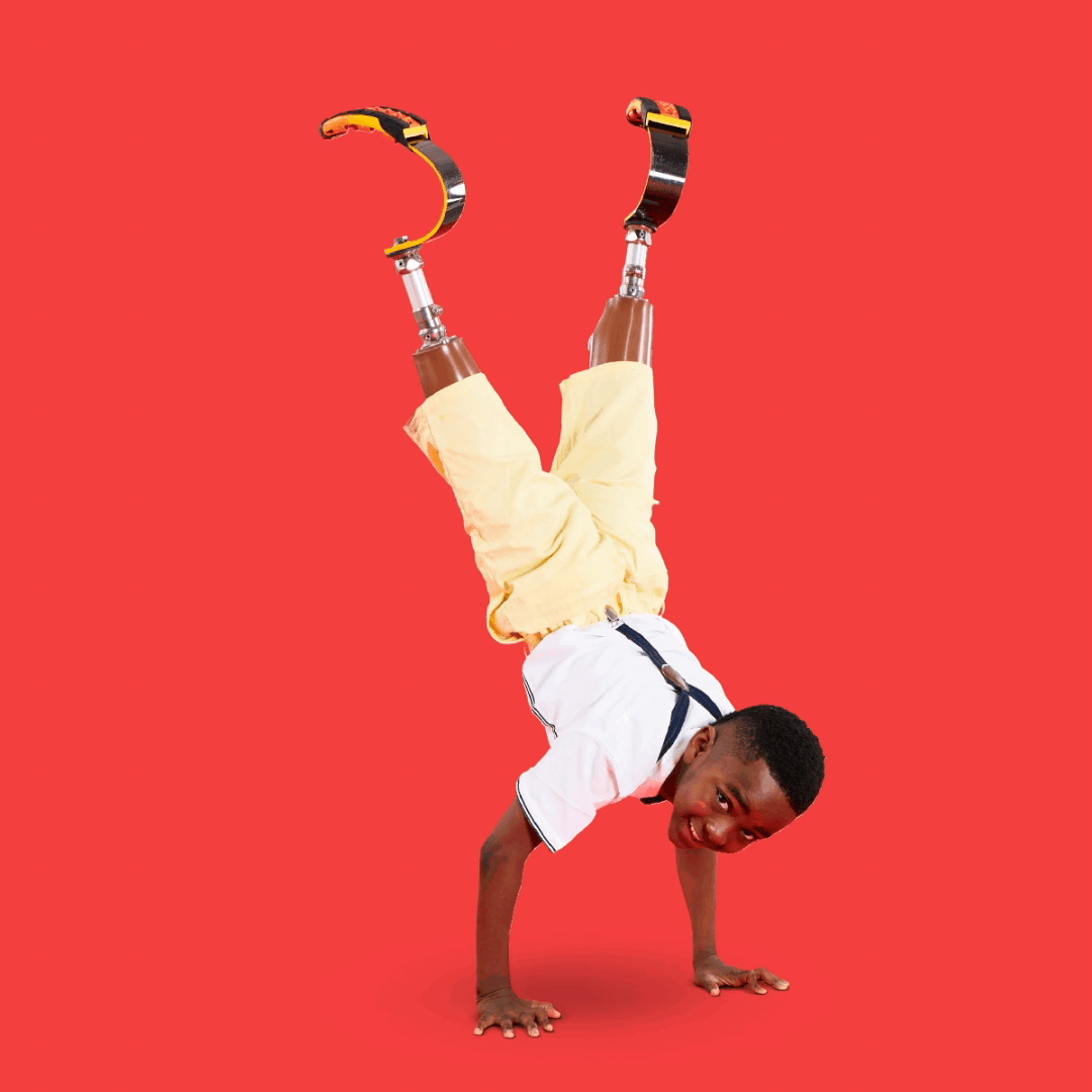


Using real patients of Scottish Rite for Children, we created a series of social media posts that elevated the kids as heroes, while bringing their difference to life in a positive way with playful animations that move freely around their body.
Rebranding
Visual Identity System
Brand Architecture
Brand Collateral
Branded Environment
Copywriting
Fundraising Campaign
Donor Platform
Brand Guidelines